
UI/UX Case Study, Mobile App


All your local deals in the same place.
Multiple stores, one app, smarter shopping.
Overview
Dealist is a prototype app designed to make it easier for consumers to find grocery store deals across multiple platforms.
The goal was to create a user-friendly platform that helps users save money and shop smarter while also supporting sustainable consumption.
Dealist was created by five design students for a university assignment in human-computer interaction.
My role
As part of the team, I took part in every stage of the process, including research, wireframing, prototyping, and user testing.
My main focus, however, was the graphic design and visual identity of the app.
I also created the logo, making sure it felt integrated with the app’s interface so that the branding and product design supported each other.
Problem
Finding the best grocery deals is often time-consuming. Prices differ between stores, and users need to check multiple apps or flyers.
Our challenge was to design one platform that gathers deals, membership discounts, and product information in one place.
Research &
Insights
Brainstorming sessions defined key user needs:
- Quickly browse local deals
- Search for specific products and compare prices
- Build shopping lists and track budgets
- Save favorite items and stores
- Access nutrition and product details
User feedback revealed the importance of:
- Clear navigation
- Easy-to-understand deal and product information
- Customizable notifications
Design process
To test navigation and task flows within the app, we started with a paper prototype. Feedback from user tests showed that the prototype was clear, but our test plan lacked details, so we refined both the app and our test process before the next test.
When the appropriate navigation process and task flow was determined, we moved on to Figma to create a digital prototype. This prototype was tested in different contexts - both a home environment and a classroom.
Participants included students, a teenager, a senior, and a working adult, giving us a wide perspective.
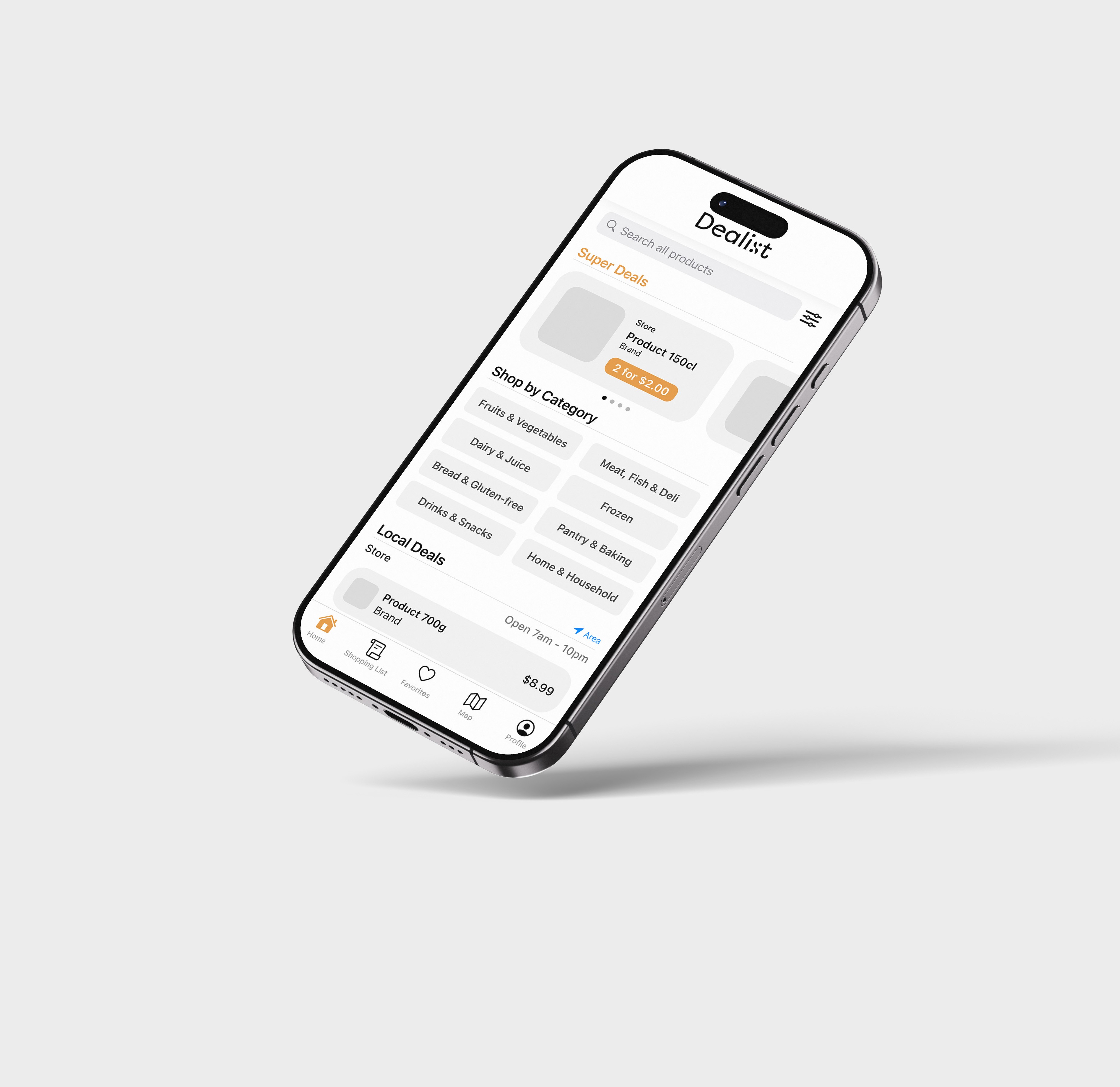
Key features
- Super Deals feed
Browse the largest discounts across
different categories and stores
- Search & Filters
Find specific products, with eco or gluten-
free tags
- Shopping Lists
Add items across multiple stores
- Favorites
Save stores and products and get
notifications when they go on sale
- Store Map
See nearby stores and their offers
- Profile & Memberships
Manage account and customize
notifications
Challenges & Iterations
- Added descriptive text to icons after testers found them unclear
- Adjusted color scheme, yellow for “Super Deals” for better visibility
- Increased text size in map view to improve accessibility for seniors
Outcome & Learnings
What we learned as a group:
- The prototype covered all core user needs
- Feedback highlighted aesthetic preferences more than functionality
- Iterative testing allowed us to quickly refine both usability and visual clarity
Personal takeaways:
- The process of creating an app, from concept to high fidelity prototype
- The importance of good and consistent spacing
- Brainstorming and testing techniques
Logo design
The logo for Dealist consists of the name in a modified sans serif typeface, with the icon replacing the “S”.
Dealist’s icon resembles a percentage sign, often used at discounts and sales.
The app icon also contains the “D” from “Dealist”.
The logotype, icon, and logo animation for this project was created entirely by me.
The logo was created in Adobe Illustrator and animated in After Effects.
Next steps
A year after the completed project, I revisited Dealist to update the UI, translate the app, and update it for export to my portfolio.
If developed further, Dealist could integrate real store APIs for live prices, user accounts for synced lists, and advanced personalization.
View more graphic design projects
UI/UX Case Study
Mobile App

All your local deals in the same place.
Multiple stores, one app, smarter shopping.

Overview
Dealist is a prototype app designed to make it easier for consumers to find grocery store deals across multiple platforms.
The goal was to create a user-friendly platform that helps users save money and shop smarter while also supporting sustainable consumption.
Dealist was created by five design students for a university assignment in human-computer interaction.
My role
As part of the team, I took part in every stage of the process, including research, wireframing, prototyping, and user testing.
My main focus, however, was the graphic design and visual identity of the app.
I also created the logo, making sure it felt integrated with the app’s interface so that the branding and product design supported each other.
Problem
Finding the best grocery deals is often time-consuming. Prices differ between stores, and users need to check multiple apps or flyers.
Our challenge was to design one platform that gathers deals, membership discounts, and product information in one place.
Research & Insights
Brainstorming sessions defined key user needs:
- Quickly browse local deals
- Search for specific products and compare prices
- Build shopping lists and track budgets
- Save favorite items and stores
- Access nutrition and product details
User feedback revealed the importance of:
- Clear navigation
- Easy-to-understand deal and product information
- Customizable notifications
Design process
To test navigation and task flows within the app, we started with a paper prototype. Feedback from user tests showed that the prototype was clear, but our test plan lacked details, so we refined both the app and our test process before the next test.
When the appropriate navigation process and task flow was determined, we moved on to Figma to create a digital prototype. This prototype was tested in different contexts - both a home environment and a classroom.
Participants included students, a teenager, a senior, and a working adult, giving us a wide perspective.
Key features
- Super Deals feed
Browse the largest discounts across different categories and stores
- Search & Filters
Find specific products, with eco or gluten-free tags
- Shopping Lists
Add items across multiple stores
- Favorites
Save stores and products and get notifications when they go on sale
- Store Map
See nearby stores and their offers
- Profile & Memberships
Manage account and customize notifications
Challenges & Iterations
- Added descriptive text to icons after testers found them unclear
- Adjusted color scheme, yellow for “Super Deals” for better visibility
- Increased text size in map view to improve accessibility for seniors
Outcome & Learnings
What we learned as a group:
- The prototype covered all core user needs
- Feedback highlighted aesthetic preferences more than functionality
- Iterative testing allowed us to quickly refine both usability and visual clarity
Personal takeaways:
- The process of creating an app, from concept to high fidelity prototype
- The importance of good and consistent spacing
- Brainstorming and testing techniques
Logo design
The logo for Dealist consists of the name in a modified sans serif typeface, with the icon replacing the “S”.
Dealist’s icon resembles a percentage sign, often used at discounts and sales.
The app icon also contains the “D” from “Dealist”.
The logotype, icon, and logo animation for this project was created entirely by me.
The logo was created in Adobe Illustrator and animated in After Effects.
Next steps
A year after the completed project, I revisited Dealist to update the UI, translate the app, and update it for export to my portfolio.
If developed further, Dealist could integrate real store APIs for live prices, user accounts for synced lists, and advanced personalization.
View more graphic design projects
UI/UX Case Study
Mobile App

All your local deals in the same place. Multiple stores, one app, smarter shopping.
Overview
Dealist is a prototype app designed to make it easier for consumers to find grocery store deals across multiple stores.
The goal was to create a user-friendly platform that helps users save money and shop smarter while also supporting sustainable consumption.
Dealist was created by five design students for a university assignment in human-computer interaction.
My role
As part of the team, I took part in every stage of the process, including research, wireframing, prototyping, and user testing.
My main focus, however, was the graphic design and visual identity of the app.
I also created the logo, making sure it felt integrated with the app’s interface so that the branding and product design supported each other.
Problem
Finding the best grocery deals is often time-consuming. Prices differ between stores, and users need to check multiple apps or flyers.
Our challenge was to design one platform that gathers deals, membership discounts, and product information in one place.
Research & Insights
Brainstorming sessions defined key user needs:
- Quickly browse local deals
- Search for specific products and compare prices
- Build shopping lists and track budgets
- Save favorite items and stores
- Access nutrition and product details
User feedback revealed the importance of:
- Clear navigation
- Easy-to-understand deal and product information
- Customizable notifications
Design process
To test navigation and task flows within the app, we started with a paper prototype. Feedback from user tests showed that the prototype was clear, but our test plan lacked details, so we refined both the app and our test process before the next test.
When the appropriate navigation process and task flow was determined, we moved on to Figma to create a digital prototype. This prototype was tested in different contexts - both a home environment and a classroom.
Participants included students, a teenager, a senior, and a working adult, giving us a wide perspective.
Key features
- Super Deals feed
Browse the largest discounts across different categories and stores
- Search & Filters
Find specific products, with eco or gluten-free tags
- Shopping Lists
Add items across multiple stores
- Favorites
Save stores and products and get notifications when they go on sale
- Store Map
See nearby stores and their offers
- Profile & Memberships
Manage account and customize notifications
Challenges & Iterations
- Added descriptive text to icons after testers found them unclear
- Adjusted color scheme, yellow for “Super Deals” for better visibility
- Increased text size in map view to improve accessibility for seniors
Outcome & Learnings
What we learned as a group:
- The prototype covered all core user needs
- Feedback highlighted aesthetic preferences more than functionality
- Iterative testing allowed us to quickly refine both usability and visual clarity
Personal takeaways:
- The process of creating an app, from concept to high fidelity prototype
- The importance of good and consistent spacing
- Brainstorming and testing techniques
Logo design
The logo for Dealist consists of the name in a modified sans serif typeface, with the icon replacing the “S”.
Dealist’s icon resembles a percentage sign, often used at discounts and sales.
The app icon also contains the “D” from “Dealist”.
The logotype, icon, and logo animation for this project was created entirely by me.
The logo was created in Adobe Illustrator and animated in After Effects.
Next steps
A year after the completed project, I revisited Dealist to update the UI, translate the app, and update it for export to my portfolio.
If developed further, Dealist could integrate real store APIs for live prices, user accounts for synced lists, and advanced personalization.
View more graphic design projects
UI/UX Case Study
Mobile App

All your local deals in the same place. Multiple stores, one app, smarter shopping.
Overview
Dealist is a prototype app designed to make it easier for consumers to find grocery deals across multiple stores.
The goal was to create a user-friendly platform that helps users save money and shop smarter while also supporting sustainable consumption.
Dealist was created by five design students for a university assignment in human-computer interaction.
Softwares used:
- Figma
- Adobe Illustrator
- Adobe After Effects
My role
As part of the team, I took part in every stage of the process, including research, wireframing, prototyping, and user testing.
My main focus, however, was the graphic design and visual identity of the app.
I also created the logo, making sure it felt integrated with the app’s interface so that the branding and product design supported each other.
Problem
Finding the best grocery deals is often time-consuming. Prices differ between stores, and users need to check multiple apps or flyers.
Our challenge was to design one platform that gathers deals, membership discounts, and product information in one place.
Research & Insights

Brainstorming sessions defined key user needs:
- Quickly browse local deals
- Search for specific products and compare prices
- Build shopping lists and track budgets
- Save favorite items and stores
- Access nutrition and product details
User feedback revealed the importance of:
- Clear navigation
- Easy-to-understand deal and product information
- Customizable notifications
Design process
To test navigation and task flows within the app, we started with a paper prototype. Feedback from user tests showed that the prototype was clear, but our test plan lacked details, so we refined both the app and our test process before the next test.
When the appropriate navigation process and task flow was determined, we moved on to Figma to create a digital prototype. This prototype was tested in different contexts - both a home environment and a classroom.
Participants included students, a teenager, a senior, and a working adult, giving us a wide perspective.
Key features
- Super Deals feed
Browse the largest discounts across different categories and stores
- Search & Filters
Find specific products, with eco or gluten-free tags
- Shopping Lists
Add items across multiple stores
- Favorites
Save stores and products and get notifications when they go on sale
- Store Map
See nearby stores and their offers
- Profile & Memberships
Manage account and customize notifications
Challenges & Iterations
- Added descriptive text to icons after testers found them unclear
- Adjusted color scheme, yellow for “Super Deals” for better visibility
- Increased text size in map view to improve accessibility for seniors
Outcome & Learnings
What we learned as a group:
- The prototype covered all core user needs
- Feedback highlighted aesthetic preferences more than functionality
- Iterative testing allowed us to quickly refine both usability and visual clarity
Personal takeaways:
- The process of creating an app, from concept to high fidelity prototype
- The importance of good and consistent spacing
- Brainstorming and testing techniques
Logo design
The logo for Dealist consists of the name in a modified sans serif typeface, with the icon replacing the “S”.
Dealist’s icon resembles a percentage sign, often used at discounts and sales.
The app icon also contains the “D” from “Dealist”.
The logotype, icon, and logo animation for this project was created entirely by me.
The logo was created in Adobe Illustrator and animated in After Effects.
Next steps
A year after the completed project, I revisited Dealist to update the UI, translate the app, and update it for export to my portfolio.
If developed further, Dealist could integrate real store APIs for live prices, user accounts for synced lists, and advanced personalization.
View more graphic design projects